Open in
Embeddable Voice Widget
Add a voice AI agent to any website with a few lines of code
The ThunderPhone embeddable voice widget lets your website visitors talk to an AI agent directly from the browser. No phone call required -- users click a button and start a real-time voice conversation powered by ThunderPhone.
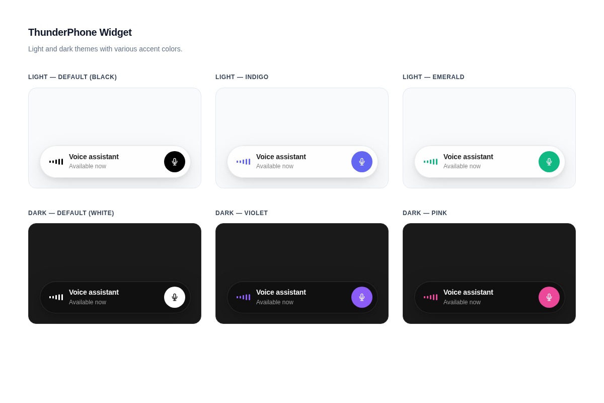
The widget renders as a glassmorphic bar that adapts to light and dark themes, with customizable accent colors and positioning. It is distributed as the @thunderphone/widget npm package and is also available via CDN for non-bundler environments.
Prerequisites
Before embedding the widget, complete these three steps in the ThunderPhone Dashboard:
- Create a web widget
Go to Web Widgets in the dashboard and create a widget. Select the agent you want to expose. Each widget has its own publishable key (
pk_live_...), which is safe to include in client-side code; the agent is resolved from the key. - Configure allowed domains
On the same widget, add the domains where it will be embedded. Wildcards are supported (e.g.,
*.example.com). The list keeps the widget from working when someone copies your key onto another site; it is not authentication, since a script outside a browser can send anyOriginheader.localhostis not allowed automatically in production: add it to the list to test locally against the production API. - Choose browser overrides
If your page sets
language,voice, orcontext, turn each one on under Browser overrides. New widgets accept none, and a session request carrying a setting that is off fails with400 override_not_allowed. See Browser overrides.
Quick Start
Install the package:
npm install @thunderphone/widgetDrop the widget into your app:
import { ThunderPhoneWidget } from '@thunderphone/widget'
import '@thunderphone/widget/style.css'

function App() {
  return (
    <ThunderPhoneWidget
      publishableKey="pk_live_your_publishable_key"
      theme="dark"
      primaryColor="#8b5cf6"
    />
  )
}
That's it. Your users will see a glassmorphic call bar that connects them to your AI agent with a single click.
Customization
The widget has four appearance props:
| Prop | Default | Description |
|---|---|---|
theme | 'light' | 'light' for white glass, 'dark' for dark glass |
primaryColor | '#000000' (light) / '#ffffff' (dark) | Accent color for the start button, waveform, and connecting indicator |
title | 'Voice assistant' | Text displayed in the widget |
position | 'bottom-right' | Viewport corner: 'bottom-right', 'bottom-left', 'top-right', 'top-left' |
<ThunderPhoneWidget
  publishableKey="pk_live_your_publishable_key"
/><ThunderPhoneWidget
publishableKey="pk_live_your_publishable_key"
theme="dark"
primaryColor="#8b5cf6"
title="Ask our AI"
/>Three more props customize the session rather than the look -- all are forwarded to the session request when a call starts. Each works only when the widget's publishable key allows it under Browser overrides; otherwise the session request fails with 400 override_not_allowed:
| Prop | Description |
|---|---|
language | Per-session language override -- a code or locale such as en, es, or fr-FR |
voice | Per-session voice override -- a voice name such as maria |
context | Factual page or site context passed to the agent (truncated server-side to 12,000 characters) |
See the React component reference for the full props table.
For a fully custom UI, use the headless hook to manage the voice session while you build your own interface. The hook exposes real-time audio levels for building audio-reactive visualizations.
Each widget conversation is a call. It counts toward your organization's concurrent-call limit (20 calls in progress by default, shared with phone and other calls) and a widget cap of 25 active sessions (or your concurrent-call limit, if that is higher). At either limit, a new conversation cannot start until a call ends.
Integration Options
Choose the integration method that fits your stack:
Pre-built UI component with built-in call controls and status display. Import, pass props, done.
Full control over the UI. The useThunderPhone hook manages the voice session while you build your own interface.
No bundler required. Load the widget via a script tag for static sites, WordPress, and other non-React environments.
Styling
The widget ships with built-in light and dark themes controlled by the theme prop, and an accent color controlled by the primaryColor prop. For deeper customization, you can override CSS custom properties and classes. See the Styling guide for details.